THE BRIEF
Key mission objectives included:
Showcase Site Development: Build a modern, visually appealing website to exhibit the architect's work.
Design and User Journey: Focus on intuitive navigation and engaging design to enhance potential client experience.
Bilingual Capability: Ensure the site is accessible in both English and French, catering to a broader audience.
Future-Proofing: Create a scalable site ready for future expansions and updates.

THE HEART OF BUSINESS
THE CONCEPT
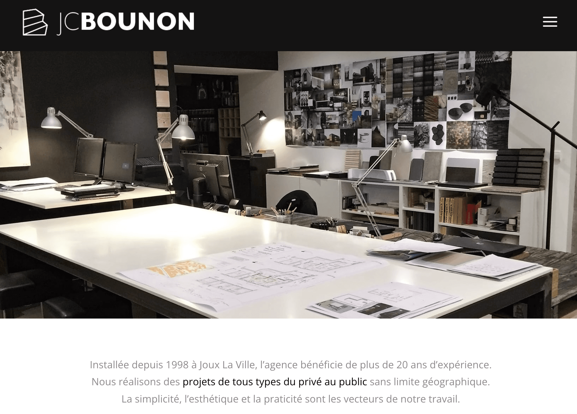
We envisioned a site that not only serves as a portfolio but also as an interactive journey into the architect's world. The design emphasizes clean lines, ample white space, and high-quality visuals to showcase projects, with user-friendly navigation that guides visitors through services, past works, and contact information, effortlessly switching between English and French.
HIGHLIGHT THE EXPERIENCE & SKILLS
THE CREATION
In realizing this vision, we developed a responsive website with a focus on aesthetics and functionality. Special attention was paid to the layout, ensuring that each project and service offered by the architect is presented in a manner that captivates and informs. The bilingual feature was seamlessly integrated, offering a toggle to switch languages without disrupting the user experience.
ANSWER THE NEEDS
Specific demands
Addressing the specific need for a site that reflects modern standards, we ensured that the platform is equipped with the latest in web design and technology, making it both forward-looking and rooted in the present. The bilingual aspect was meticulously crafted to cater to an international clientele, enhancing the architect's global reach.
THE OUTCOME
We set out to craft a showcase website, focusing on a modern, bilingual presentation to enhance visibility and prepare for future expansion. This site is a testament to the architect's innovative vision and skill, inviting his customers.
Through minimalist designs and bilingual functionality, the platform reflects the architect's 21st-century ethos, laying a solid foundation for growth and broader business opportunities.


